Galaxy S26 Ultra Upgrade Left Me Conflicted: Honest Thoughts

SammyGuru is reader-supported. We have affiliate and sponsored partnerships, so we may earn a commission when you buy through links on our site — at no extra cost to you. Learn more.
The Galaxy S26 Ultra has exceeded nearly all my expectations, largely thanks to One UI 8.5. The device delivers by far the most complete and refined Android experience. I especially like One UI 8.5’s improved device responsiveness and fluidity. The camera improvements, along with clever, subtle use of AI, enhance images without fabricating details. Additionally, the return to aluminum feels better in the hand; it provides superior grip and improved thermals.
Yet I remain conflicted, coming from the Galaxy S24 Ultra, a device I still consider to be the last true spiritual successor to the Galaxy Note. While the S26 Ultra represents a clear step forward in many areas, a few regressions feel unnecessary and leave a bit more to be desired.
The Note Identity is Nearly Gone
When the Galaxy Note merged with the Galaxy S series in the Galaxy S22 Ultra, I was thrilled. Samsung finally delivered the best hardware at launch instead of forcing a mid-year wait. I loved the S22 Ultra’s design and appreciated it even more with the Galaxy S24 Ultra.
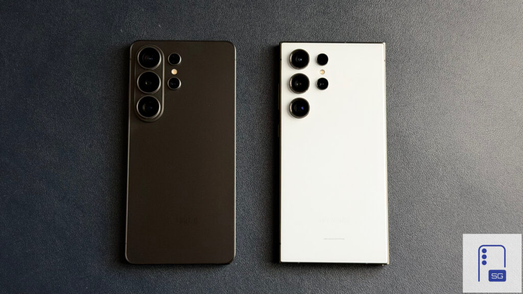
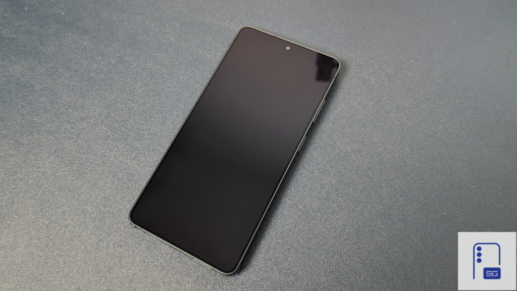
However, over time, the distinct Note identity has gradually been stripped away. We lost Bluetooth functionality in the S Pen with the Galaxy S25 Ultra and moved to a curved design language. While it was a great stopgap between comfort and design, the Galaxy S26 Ultra’s design is now closer to the Galaxy S21 Ultra.
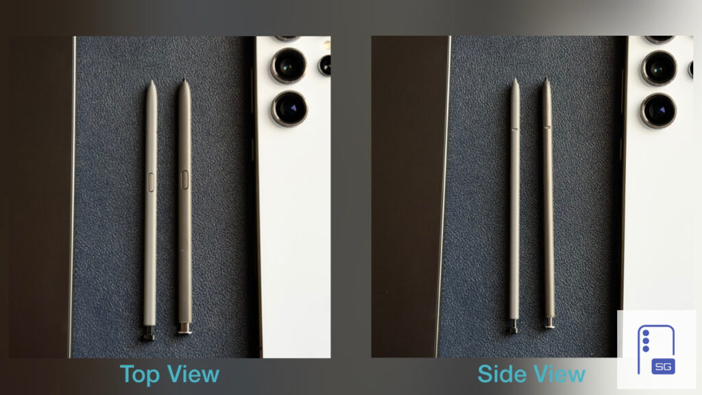
The S Pen now feels noticeably cheaper and hollow compared to the solid feel of the Galaxy S24 Ultra’s version. Even the top click and side button lack the satisfying tactile feedback; it produces a cheap metallic sound as well.
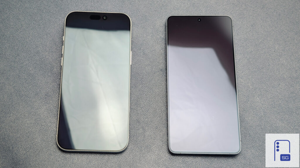
While the S25 Ultra’s rounded design served as an acceptable compromise, it still retained some of that signature boxy character. I cannot say the same for the Galaxy S26 Ultra. After spending time with it, the phone has lost much of its distinctive Ultra identity.
In person, it has become difficult to immediately recognize the Galaxy S26 Ultra as an Ultra model. I asked my coworker to pass me my phone, and he confused it with an iPhone. This never happened with my Galaxy S24 Ultra. He casually remarked that it looked like an iPhone because of the curved edges.
One Display Issue to Another
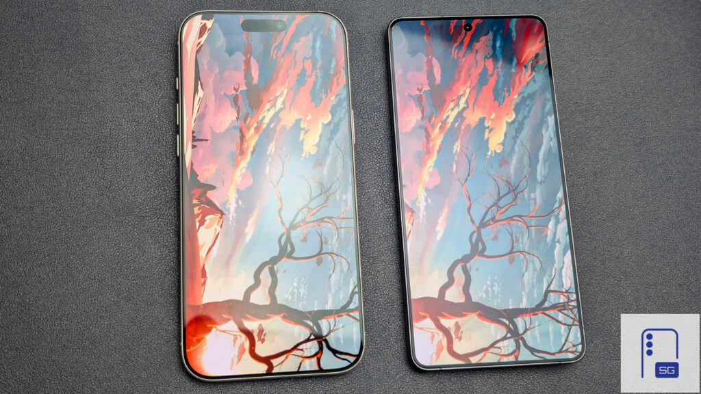
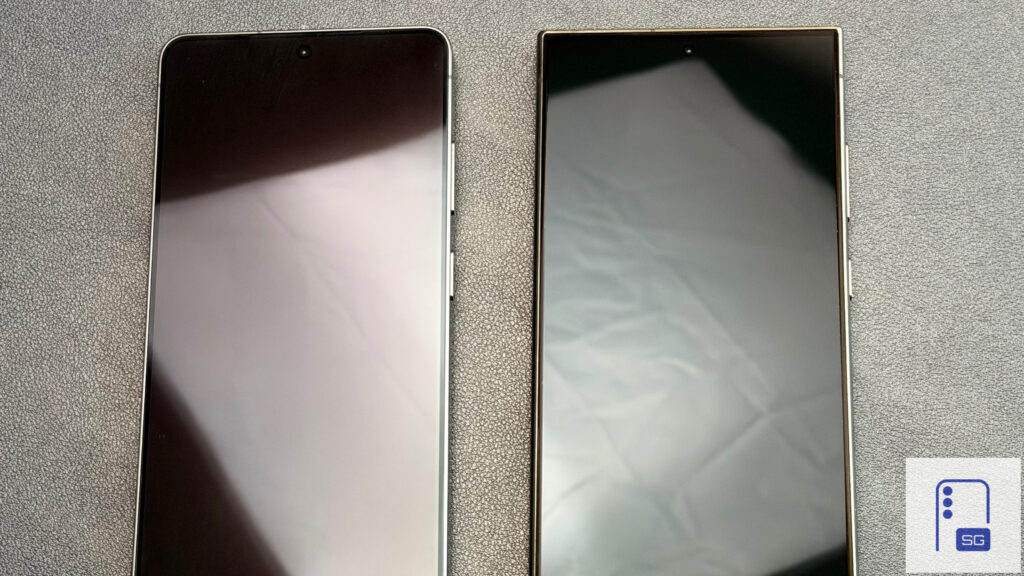
The Galaxy S24 Ultra and Galaxy S26 Ultra share one unfortunate trait: disappointing display quality in darker environments. In well-lit rooms or outdoors, both panels look phenomenal, vibrant, and sharp.
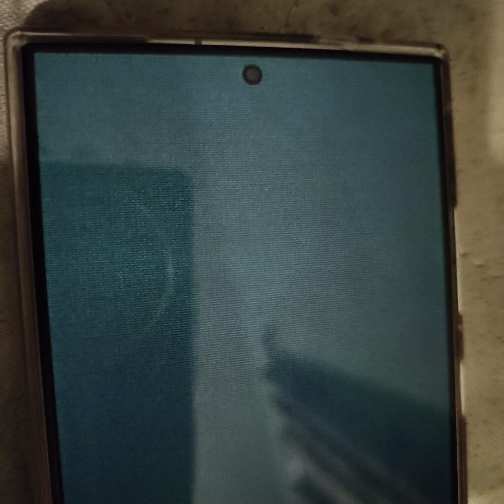
I wasn’t able to capture this issue on my own unit before trading it in, but it definitely existed. Reddit user IAMPAIN07 posted clear examples showing the S24 Ultra display’s low-light shortcomings. In dark environments, the device develops a noticeable grainy green tint. Under the same conditions, the S26 Ultra also shows a slight resolution drop caused by the privacy layer, though not as prominent as the S24 Ultra.
Despite the anti-reflective layer’s reduced performance on the Galaxy S26 Ultra, Samsung still delivers the best anti-reflective coating. It’s clear when compared to the iPhone 17 Pro Max.
That said, the Galaxy S24 Ultra’s anti-reflective coating still feels superior in everyday use. However, I don’t see this as a major issue. The Galaxy S26 Ultra has a brighter display that stays brighter longer, making the change feel neutral overall.
On the bright side, the Galaxy S26 Ultra doesn’t suffer from an easily worn-out coating. Just like Reddit user Different-Shake-348, I experienced the same problem with my S24 Ultra.
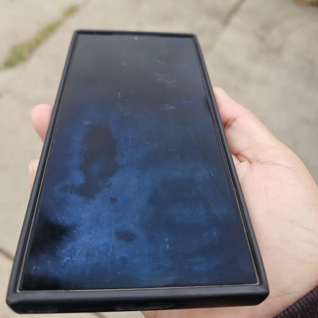
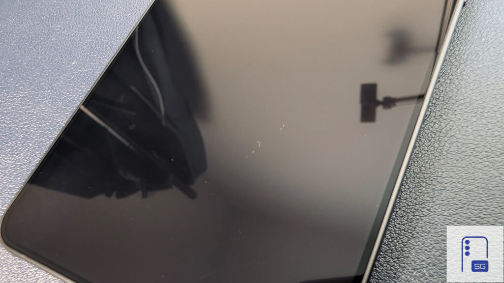
Since receiving the Galaxy S26 Ultra, I haven’t needed a screen protector at all. Both the display and the anti-reflective coating have held up remarkably well. The only mark I can find is one I have to look closely for.
With my Galaxy S24 Ultra, the experience was very different, similar to Different-Shake-348. When Samsung Care replaced the device, I immediately applied a Flolab anti-reflective screen protector because the original coating scratched and wore off so easily.
One UI 8.5 Contributed the most to the Experience
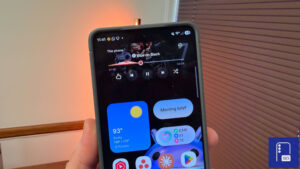
I can’t recall the last time I enjoyed a Samsung flagship this much on day one. The fluidity, stability, battery life, and thermals now surpass both my Pixel and my iPhone. This wasn’t the case just a few years ago. One UI 7 and the initial One UI 8 releases suffered from poor rollouts and frustrating communication. One UI 8.5 finally delivers much better stability, though timely availability is still an issue.
One UI 8.5 has successfully achieved the “Emotive” feel that was promised with One UI 7, from the satisfying haptic feedback when adjusting volume, to the gradient blur that has a subtle sand-like texture that resembles distant stars, and the new embossed icons.
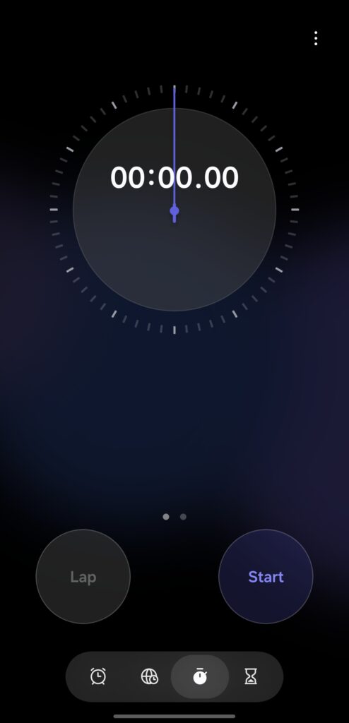
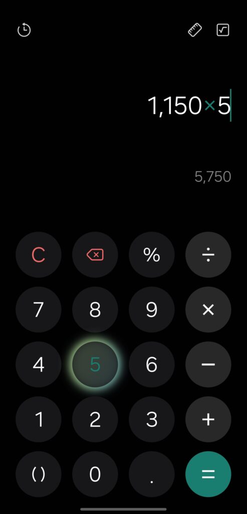
When it comes to the apps, the Clock app features a beautiful gradient background with simplified one-handed, exactly how One UI should feel. In the Calculator app, every number and symbol displays a gradient effect when tapped. Samsung has a clear path they are running towards, bringing graceful gradients and subtle blur.
One UI 8.5 has carved out its own identity without feeling like a direct iOS clone. While it borrows some elements, it’s nowhere near the level of copying seen in OxygenOS or ColorOS.
Yet I Remain Conflicted
Despite the trade-offs, I’ve enjoyed every second with the Galaxy S26 Ultra, yet there are still moments when I question my decision.
Had Samsung released the stable version of One UI 8.5 for the Galaxy S24 Ultra, would I have upgraded? Considering how much One UI 8.5 has contributed to my enjoyment of the Galaxy S26 Ultra, I can’t help but wonder: is it the hardware or the software that has truly shaped my experience?
Written by
Aladdien FadhelAladdien Fadhel provides Samsung reviews and in-depth analysis for SammyGuru. By tracking the development of One UI and exploring Samsung's product roadmap, he delivers insights designed to benefit both the manufacturer and the user. A dedicated tinkerer, Aladdien prefers fine-tuning his current hardware to maximize its potential rather than opting for an immediate upgrade.
Follow us on Google Discover & set us as a preferred source in Google News
Share this Post
___________________________


New Blog Posts
___________________________
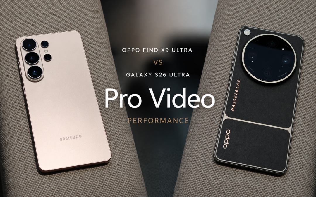
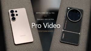
OPPO Find X9 Ultra vs Galaxy S26 Ultra: Pro Video Performance
Pro Video doesn’t follow the same script as Auto Video

Quick Share and AirDrop Found Vulnerable to Nearby Wireless Attacks
The good news is that most of the flaws have already been patched
Breaking: Samsung Officially Teases New Galaxy Z Fold 8 (Wide)
“New Shape. New Joy” it is!