Samsung offers a more flexible Quick Panel on One UI 7.0
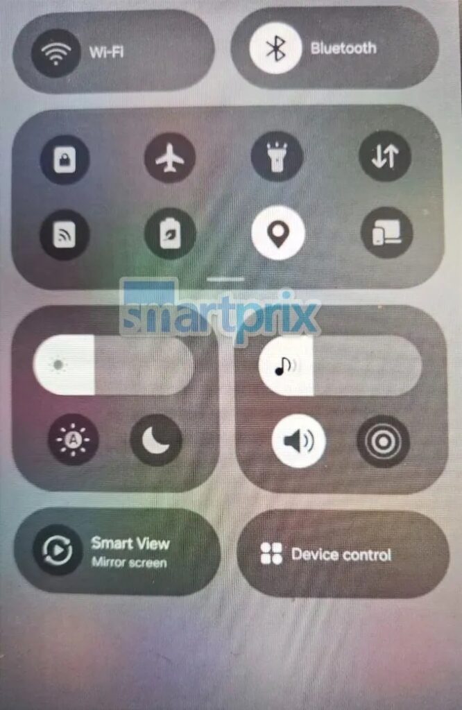
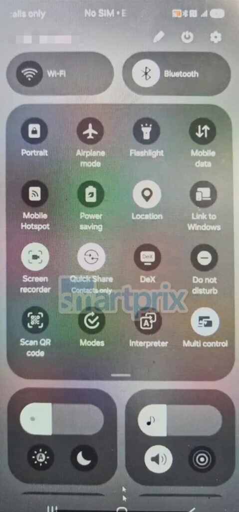
Over the past few weeks, X user @chunvn8888 has shared plenty of information about One UI 7.0 in bits and pieces. They gave us visuals of the redesigned UI and leaked some of the new features in the pipeline. A screenshot posted on X showed the revamped Quick Panel with four groups of quick action buttons. At the top are two large bills for Bluetooth and Wi-Fi, followed by the expandable and swipeable main panel.
Below those are two more squircle boxes with three buttons each. One has a brightness slider and quick buttons to toggle auto-brightness and dark mode on/off. The other has a volume slider, a sound/vibration/mute toggle, and a mysterious new button (possibly media output). At the bottom, we see two more pills for Smart View and Device control. This is the default setup, with the volume slider being one of the prominent new additions.
However, if you don’t like this setup, you can rearrange the buttons to put any toggle in any of the boxes. While One UI 6 already lets you move the buttons on the main panel, the rest of the groups cannot be customized. The Bluetooth and Wi-Fi buttons are fixed to the top. You cannot move those even if you don’t use them frequently. With One UI 7.0, Samsung finally adds more UI customization options to Galaxy devices.
Samsung’s Android skin needed changes
Samsung needed to do something different this year to enhance the One UI experience. The same source says the Quick Panel has been separated from notifications — you can swipe left/right to switch between the two views. It appears the Korean firm studied all custom UIs, including Apple’s iOS, and copied their best elements. We won’t complain as long as it’s a smooth experience. Stay tuned for the One UI 7.0 beta release date.


