Google is onto something with the Gemini app, which replaces Google Assistant. While Google officially unveiled Gemini (formerly Bard) a little over a year and a half ago, it’s now receiving some of the most useful features in recent times. Due to these many features and options, the app’s user interface has become a bit cluttered. Thankfully, an APK teardown reveals that Google may soon give Gemini a much-needed facelift.
Gemini is cluttered at the moment, but a facelift is in the works
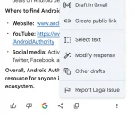
Right now, when you launch the Gemini app, you’re likely to be overwhelmed by the options available. To put this into perspective, long-pressing on a response opens options like exporting to Docs or creating a public link, while the three-dot menu gives you choices to modify the response or select text. While these options are useful, having them in different menus can be confusing. It’s not always clear where to go for a specific action, which generally slows down the user experience. But Google might have a plan to fix this.
Folks at Android Authority tore down the APK file of what happens to be a Google app (v15.46.36), where they found plans to consolidate all the options into a single menu, making it easier for users to access everything in one place. Once the update goes live, whether you long-press a response or use the three-dot menu, both will trigger the same simplified interface, showing all the options—such as rating responses, exporting context, and more. All of these will be in one spot (screenshot attached below). This is very similar to the recent redesign of Circle to Search, which incorporates a new app drawer.
- Current Gemini Menu (Android Authority)
- Upcoming Gemini Menu (Android Authority)
When will the much-needed facelift come to the Gemini app?
There’s no exact release date at the moment because Google hasn’t officially announced the upcoming facelift. However, it was revealed in an APK teardown, as detailed by AssembleDebug. So, it’s best to keep our fingers crossed and keep waiting. Although most features from the beta version make it to stable versions, some still don’t.


