
Spotify Turns App Icon Into a Disco Ball for 20-Year Celebration
Some Spotify users woke up confused this week after noticing something very different on their home screen. The iconic green Spotify logo had suddenly turned into a shiny disco ball. And at first, many people genuinely thought it was a weird update glitch or just a troll. But no, the redesign is completely intentional, though not permanent.
Spotify’s 20th anniversary turned its icon into a literal disco ball
The new logo keeps Spotify’s classic green color palette but now wraps it in a reflective 3D disco-ball-style design. The reason for the icon change? Spotify temporarily changed its logo as part of its 20th-anniversary campaign, “Spotify 20: Your Party of the Year(s),” to celebrate. It turns out some folks on Reddit and X have mixed opinions. Personally, I like it. It looks retro and has a vintage vibe.
As folks over at Variety say, the temporary redesign ties directly into Spotify’s larger nostalgia-themed anniversary campaign. It focuses on users revisiting their entire listening history through the new “Party of the Year(s)” feature, which was introduced this week.
Even Spotify joined the chaos
The redesign immediately exploded across social media after Pop Base posted on X that Spotify unveiled the new app icon. The funnier part? Spotify itself jumped into the replies under the Pop Base post, basically confirming that it’s real. It is indeed a new icon. The company leaned into the chaos surrounding the redesign. Moreover, it did this instead of trying to explain it too seriously.
Spotify unveils new app icon. pic.twitter.com/bwCtkJCrtx
— Pop Base (@PopBase) May 14, 2026
One reason this redesign stands out so much is that modern app icons have become extremely flat and minimal over the last decade. Spotify suddenly doing reflections, shiny effects, and a disco-ball aesthetic feels almost aggressively anti-minimalist. That’s probably why so many people are divided about this.
It’s weird, unnecessary, and slightly chaotic, sure, but at least it has personality. Furthermore, it marks Spotify’s 20th anniversary pretty great. Most app icons today look clean and minimal. Sometimes they are a bit too minimal, so that they all blend and lose some of their originality and character.
The retro disco-ball icon immediately catches your attention, and for a music app celebrating 20 years, it actually fits the vibe surprisingly well. But as mentioned above, it’s not a permanent change. Spotify has confirmed that the traditional logo will be back soon, so why not enjoy this temporary refresh while it lasts?
Follow us on Google Discover & set us as a preferred source in Google News
Share this Post
___________________________


New Blog Posts
___________________________
Samsung Stays on Top in Q1 2026 Even as Smartphone Production Dips
Samsung leads Q1 2026 smartphone output despite market slowdown
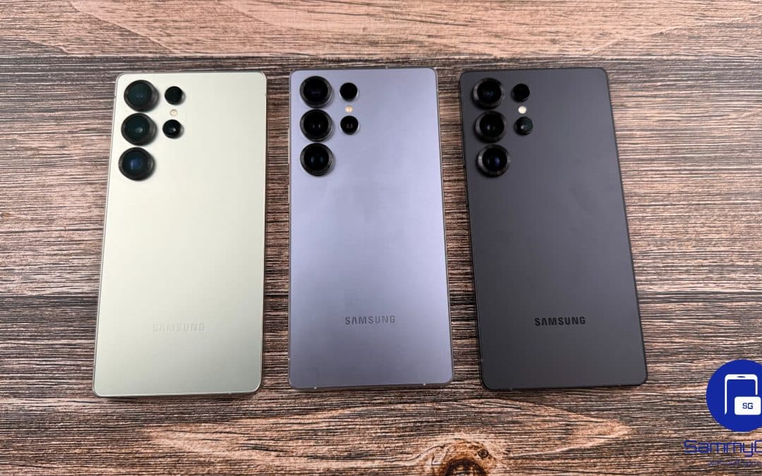
Galaxy S25 Ultra 1TB Drops to $1,099 in a Deal That’s Hard to Ignore
This Galaxy S25 Ultra deal brings the 1TB model down to $1,099
Gemini Went Down for Some Users, but Fixes Are On The Way
Gemini started throwing errors across several users and platforms

