Samsung One UI 7.0 is on the horizon, with just a few weeks before we get a chance to test Samsung’s latest operating system in beta form. Galaxy fans are excited for any tidbits about the new OS before launch. Today, we finally have a wealth of new information from leaker Chun Bai on X. The news is somewhat disturbing, as One UI 7.0 appears to be a mashup of iOS 18 and popular Android skins from China like ColorOS and HyperOS. Let’s quickly run down all the leaked features and discuss what this means for Galaxy smartphones going forward.
Major Design and UI Changes
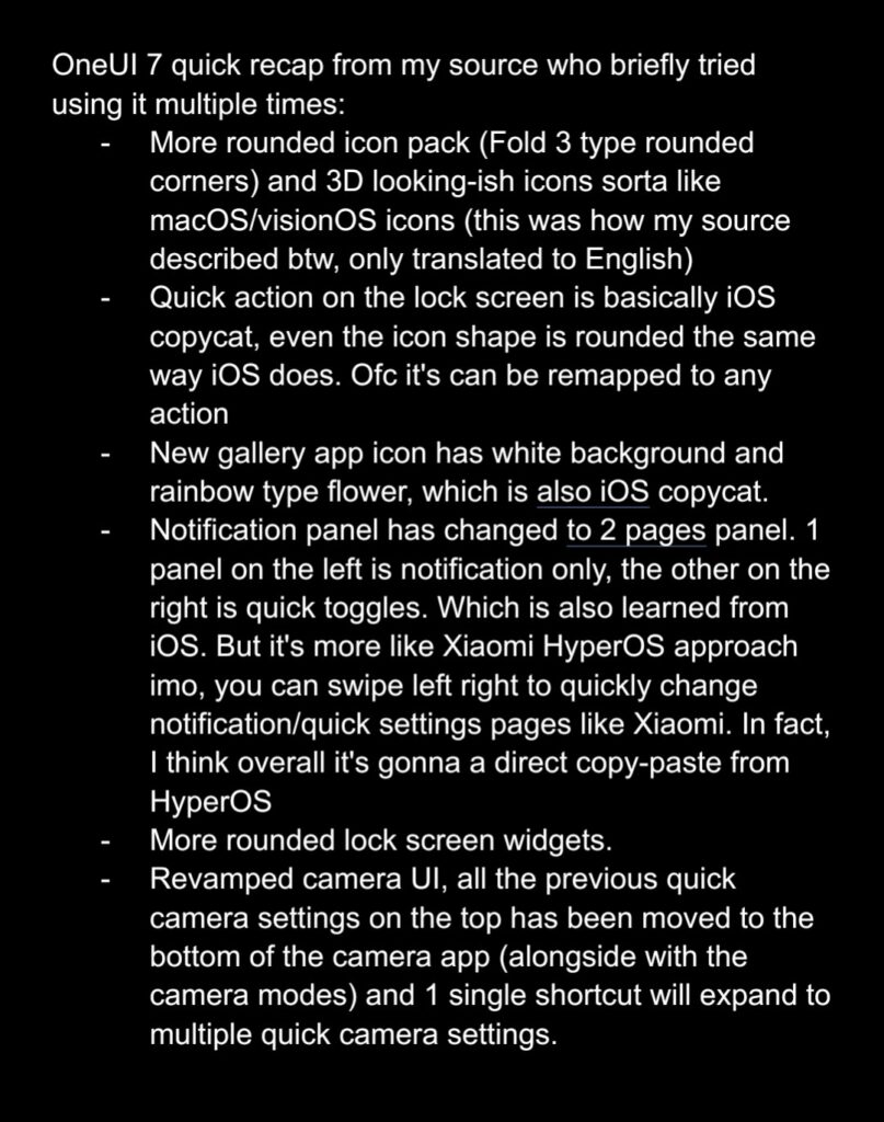
According to his source, Bhai suggests that Samsung One UI 7.0 will implement the following design and UI changes (his wording is in the screenshot below, but it does not contain all of the information he summarized on X):
- More rounded and cartoonish icons, those that resemble icons from ColorOS or Mac OS.
- New quick action on the Lock Screen that mimics iOS and even has a similar icon.
- New Gallery icon has a white background with colorful flower pattern, the same icon used in iOS and Color OS.
- Notifications and quick settings are now separated on two pages. This is also identical to ColorOS and HyperOS. This is an awful change, in our opinion.
- Quick settings can be moved around like iOS 18, but reshaping them is not yet supported in One UI 7.0.
- More Rounded Lock Screen widgets.
- Entirely revamped camera UI with quick settings moved to the bottom.
- Battery percentage now lives inside the battery icon.

What Does This Mean For Galaxy Users?
In our humble opinion, most of these changes are bad for Galaxy users and Samsung’s brand identity. Bringing One UI in line with major Chinese Android skins and iOS does not help Samsung stand out to potential new users. It would seem that many of these changes are to attempt to appeal more to iOS users who may consider the move to a flagship Galaxy device. This is also part of a larger trend toward making Samsung more like Apple than ever before, both in hardware strategy and software design.
The only changes in the list that get us excited are the changes to the quick settings size and shape customization, which is one area where emulating iOS 18 may be a good thing. Separating the quick settings page from notifications is change for change’s sake. Hopefully Samsung will provide an option in Good Lock to revert to the old quick settings style. In fact, I’m hopeful many of these UI changes will be modifiable via Good Lock. As for the camera UI, I will definitely give the new design a shot to see if it has usability improvements, before making a final judgement.
We will keep you up to date on all things Samsung One UI 7.0 and have a full review of the beta once it is available. In the meantime, make sure to sign up for our free mystery box program to get a set of free accessories when you order your next Samsung device! Let us know what you think about these potential changes to One UI 7.0 in the comments below!


