Android Auto has been phenomenal for years, but occasionally it pushes some updates that irk most users. Take the recent Google Maps update on Android Auto, for example, which has been annoying many who are finding it difficult to navigate.
Latest Google Maps update on Android Auto is a pain in the head for users
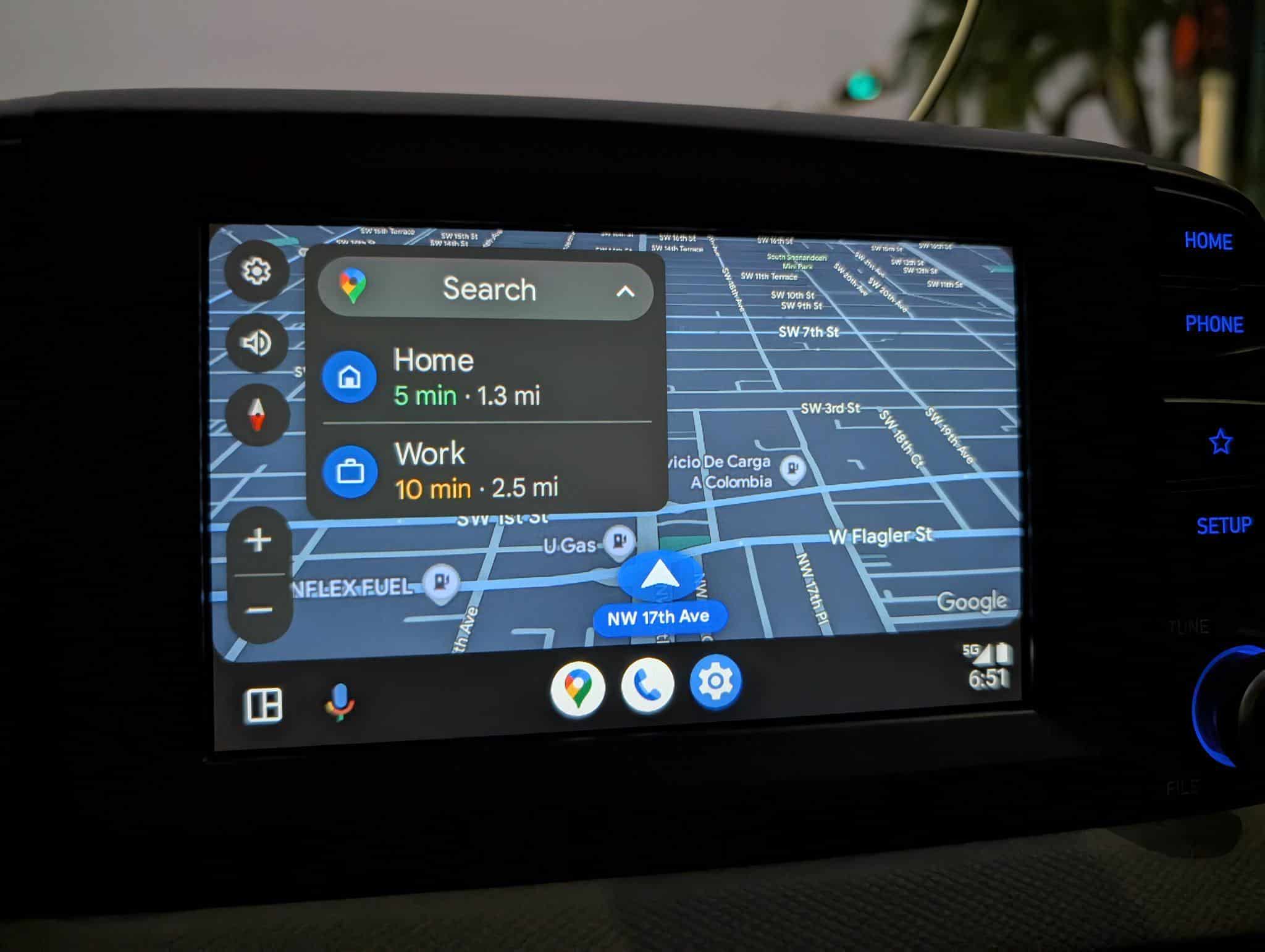
Reddit user u/steelbreeze9 noticed a recent update to Android Auto’s Google Maps where the arrow now appears in the center of the screen instead of being shifted to the right. Sounds like a win, right? Well, not so fast. The catch is Google’s new destinations menu, which takes up a big chunk of the screen, blocking nearby streets. Sure, you can tuck it away to see the map, but it doesn’t stay hidden, and that’s been rubbing Reddit users the wrong way. You can see how it looks in the image attached below.
In the Reddit thread, several users were complaining about how terrible the latest Google Maps update on Android Auto is. One Reddit user, u/Access_Denied2025, wrote, “The destination box is still way too big and really needs a transparency setting.” Another wrote, “I absolutely despise that box. Even when you click the map to view the map larger, it’s the same god**mn size because that black box is in the freaking way. I hate it with a passion.”
Folks at 9to5Google say that the latest Android Auto v13.6 doesn’t introduce this behavior. The publication added that they observed the centered car icon interface was already active in Android Auto v13.4. However, it only became visible after updating to the most recent version of Google Maps. Google hasn’t responded yet as to why it did so, but 9to5Google guesses that “this helps on the increasingly common square displays showing up in more vehicles.”