In late 2018, Samsung introduced One UI. It aimed to create a clean, consistent user interface that has the user experience at heart. The design dazzles with a fun, whimsical aesthetic that welcomes users and delights them — rounded edges, bubbly icons, and perfect colors. Samsung actually released guidelines for developers and designers so they could recreate the One UI experience in their apps. But that’s been long abandoned, and One UI has evolved drastically, especially with the recent One UI 7. So, I’ve decided to take matters into my own hands.
Introducing the One UI Design Kit — the one-stop shop for creating a One UI themed design. It has everything you need, from a library of over 1,500 icons to a wide range of buttons, menus, and toggles for designers and developers to take advantage of. Let’s take a deeper look at it.
Before you jump in
Before you begin, check that you meet these prerequisites. First, the Design Kit is made fully in Figma, a UX Design tool used by many in the industry. You will need some experience with the basics of Figma, including a basic understanding of Auto Layout and Components. Refer to Figma’s documentation if you get stuck. Figma can be used for free, but some features, like converting elements to code, require a Figma Pro subscription. I also will be keeping the Design Kit free of charge, so anyone can use it and create amazing things.
Let’s get started
First, visit the One UI Design Kit listing on Figma Community. Sign in and click ‘Open In Figma‘, give it a second, and you should be greeted by the Welcome page.
Here, you’ll get a changelog, so you know what version of the Design Kit you’re using, as well as all the changes. You’ll also see the contributors that helped make everything. Make sure to check them out, and you’ll see a download link to the One UI Sans font. Download and install that font, and relaunch Figma before you continue any further. Follow these steps carefully, or you won’t be able to edit any of the text. Once you have done that, we can progress further.


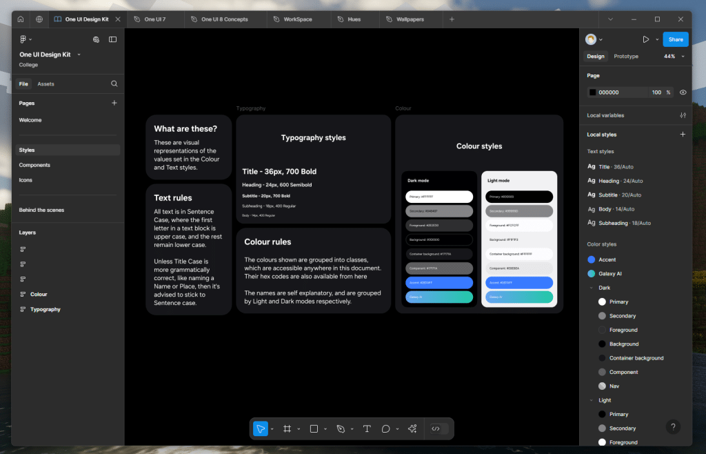
Text and Color styles
The first page you will see is Styles, where all the text and color presets are shown. You’ll also see them along the right sidebar when nothing is selected. They’re available anywhere within the file when nothing is selected or in any color or text field. But there’s also a cool visual representation, with sizing, thickness, and hex codes available to reference.
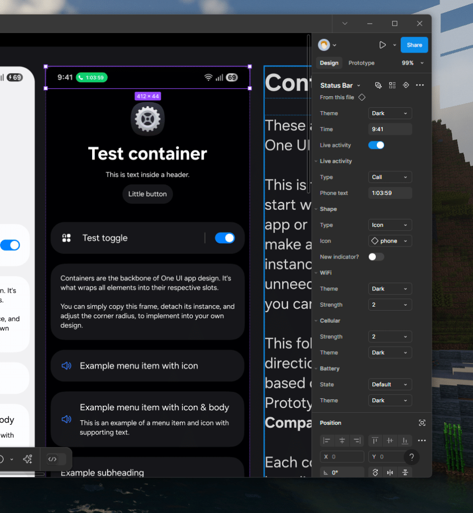
All the Components in the One UI Design Kit
The next page is Components, where all the juicy stuff is — this is the very core of the One UI Design Kit. There’s a lot going on here, and I won’t go over everything. But here are some general guidelines on how to use some of the components.

You’ll want to start with the Containers. These have all the spacing and layout rules intact. Detach its instance by pressing CTRL + ALT + B (or CMD + OPT + B on Mac), then add and remove elements as needed.
Most components will have Properties available in the right sidebar when highlighted. There are toggles to turn stuff on and off, dropdowns for stuff like Theme or Variant switching, and some text fields to edit an item’s contents. You can also replace the icons with anything in our library, which I’ve explained below.

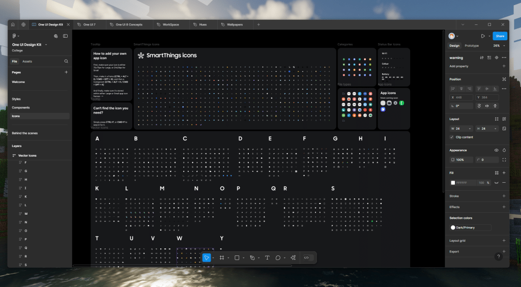
So many icons
Finally, icons — tons and tons of icons. Everything from back buttons, keyboard options, photo editor symbols, device identifiers, and even Galaxy AI are here. There are also many SmartThings device icons to choose from. I rip these directly from the apps themselves, and convert them to vectors that can be used in Figma. The running total is just over 1,500 icons, and more get added with each new version of the One UI Design Kit.
This should be everything you need to get started. There are tips littered about to guide you along, but if you ever get stuck, shoot me a DM on Twitter/X at @thatjoshguy69, or hit me up over email at email@thatjoshguy.me.
Huge thanks to both @DalgleishGX and @Tim_tom_0 for the help making the components. Now go make some amazing designs!


")