Galaxy S24 seriesGoogle is now finally rolling out the revamped Circle to Search for Android, including Galaxy devices. We had reported that a redesigned Circle to Search could be in the works, and it’s finally here. As expected, the rollout could be in batches, so it’s currently rolling out to a limited group, and soon it will be available to everyone.
The revamped Circle to Search now rolling out to Galaxy devices
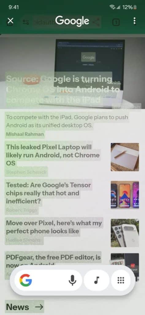
While Circle to Search first landed on the Galaxy S24 series as a simple, albeit useful, feature for quick on-screen searches, it has become a more polished tool. Visually, the new Circle to Search adopts a cleaner, more contemporary aesthetic. What was previously a slim, utilitarian strip, is now housed within a chunkier, rounded box that feels more in tune with modern design.
The buttons surrounding the search bar have been redesigned to fit seamlessly into this new, more organized layout, giving the entire interface a much more cohesive and spacious feel. You can take a look at the revamped Circle to Search running on the Galaxy S24 Ultra (attached below).
The new Circle to Search app drawer feature we posted about @sammygurus the other day is now rolling out more widely to Galaxy phones. It’s here on my Unlocked S24 Ultra tonight. pic.twitter.com/SbiElLWQOj
— Jeff Springer (@jspring86az) November 23, 2024
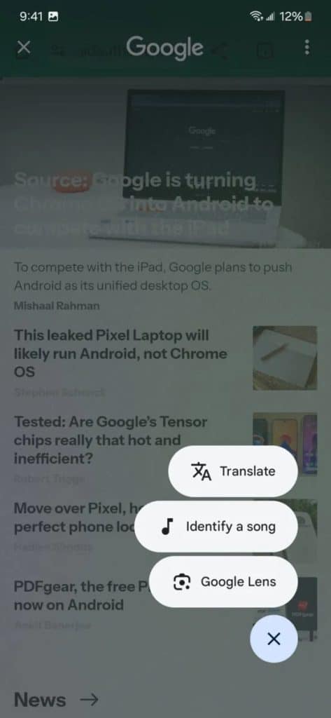
Translate and Google Lens buttons have now moved to App Drawer
As first spotted by Android Authority, Translate, Identify a song, and Google Lens now appear in a new menu. These were previously spotted in a beta build but are now rolling out to select Galaxy devices.
You can check whether the revamped Circle to Search is available for you. Go to the Play Store, search for the Google app, and update it to the latest version. In short, the current UI makes it look more polished and suited for Galaxy phones.
Have you received the revamped Circle to Search on your Galaxy phone yet?


